Imagine this…
You’ve been working on your website for weeks.
On Instagram, you made a post about it. You’ve shared it in all of your WhatsApp groups. You even did some Google Ads.
There is actual traffic to your website.
Then, however, nothing occurs.
No sales. No registrations. No messages. Nothing but quiet.
It’s similar to inviting a hundred people to your birthday celebration. and no one is bringing a present.
Does that sound familiar?
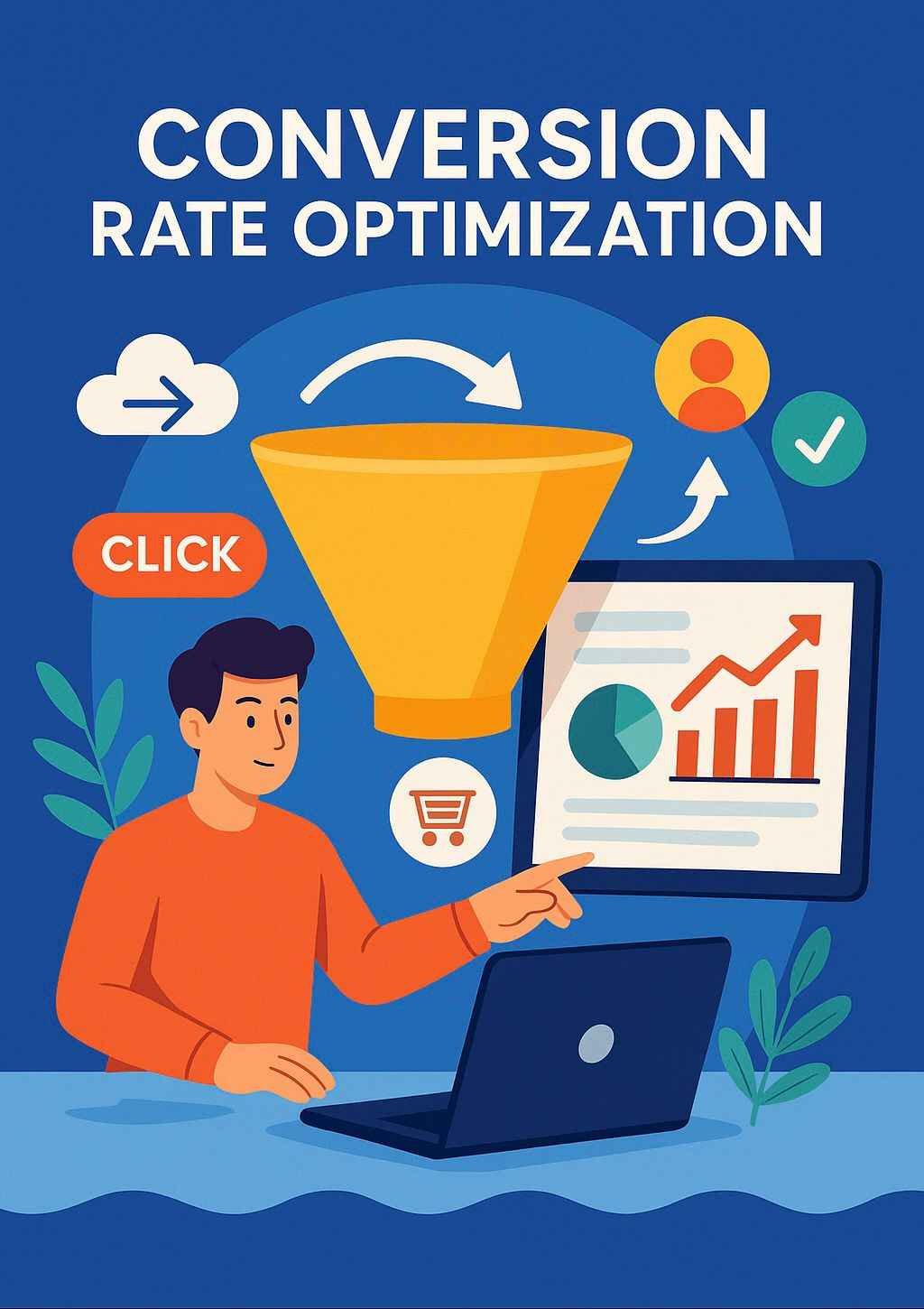
Conversion Rate Optimization (CRO) can help with that. Increasing website traffic isn’t the goal. Conversion Rate Optimization focuses on converting your current visitors into paying customers, subscribers, and buyers.
What’s the good news?
Even a small adjustment can occasionally have a significant impact and help you begin to see improved outcomes.
Conversion rate optimization, or CRO, will be explained in an easy-to-understand manner so that you can begin utilizing it immediately.
What Is CRO Actually?
Let’s avoid making things too complicated.
Conversion Rate Optimization(CRO) is the process of improving the persuasiveness and usability of your website.
Whether you want people to download your app, buy your product, schedule a call, or join your email list
Helping more people follow through without pleading, deceiving, or overwhelming them is the goal of Conversion Rate Optimization.
What Does “Conversion Rate” Mean?
Simply put, it’s the number of people who perform the action you desire.
Here’s a more human way of thinking about it, though, rather than using dull math:
Suppose a hundred people enter your store.
Your store is doing alright if only three of them make a purchase, but something is obviously not working.
Now picture adjusting your design, putting more readable signage, and providing a complimentary gift at the counter. and suddenly 15 out of 100 start buying.
That’s Conversion Rate Optimization(CRO) in action.
same individuals. same shop. improved outcomes.
1. Treat Your Website Like a New User: A Conversion Rate Optimization Approach
You have a thorough understanding of your website.
However, a fresh guest? They are merely attempting to ascertain what you do.
Most visitors take less than three seconds to decide whether to stay or leave. That’s less time than blinking three times.
Consider this:
- Is it possible for someone to grasp the content of my website right away?
- Is there a specific task I want them to complete?
- Or am I giving them too much information at once?
Start your homepage with:
- A concise line that summarizes the primary advantage for your client
- A bold, clear headline that informs them of what you have to offer
- One straightforward call-to-action (such as a button or link) to direct them
Give them a clear direction from the beginning and allow them to scroll if they so choose. When it comes to conversion rate optimization, the first few seconds are crucial.
2. Your website must load quickly—really quickly.
Let’s face it, we’ve all abandoned websites that took an excessive amount of time to load.
Your conversion rate can drop by more than 7% with just a one-second load time delay. It’s a huge deal.
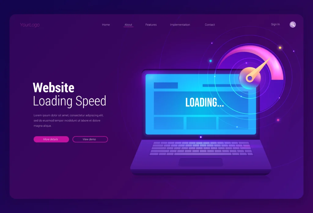
Speed-Up Solutions:
- Image compression (TinyPNG is great)
- Remove any stray videos or sliders
- Use a CDN (Content Delivery Network)—Cloudflare is a great one—to load content faster
Secret: If you have a loading animation or loading bar, it might encourage people not to exit while waiting—after all, it’s only a few seconds.
3. Your CTA Buttons Should Promote, Not Concede
CTA stands for Call to Action.
Think of it as the “Here’s what to do next!” message displayed on your website.
If your button reads “Click Here” or “Submit,” it’s like a salesperson whispering.
Take more risks.
Try these instead:
- “Schedule My Free Session”
- “Begin My Free Trial”
- “Acquire Immediate Access”
- “Get the Checklist”
Try out various iterations of the button’s colors, size, text, and even placement. Small Adaptations can make a big difference, particularly when it comes to conversion rate optimization.
4. Clear Up the Disarray
Visitors leave your website when it appears to be a notice board with posters all over it.
Here’s the rule: One goal, one page.
Concentrate on obtaining email sign-ups if that’s your aim.
Avoid being distracted by blog links, ten different offers, or all of your social media icons.
The golden rule of conversion rate optimization states that less clutter leads to higher conversions.
5. Employ Easy Psychology Techniques (That Work)
To use persuasion, you only need a few clever nudges and no psychology degree.
There are a few that are very effective:
- FOMO & Urgency: “Only 3 spots remain!” or “The offer expires at midnight.”
- Social Proof: Display positive client testimonials, actual images, or the number of users of your product.
- Price Anchoring: Put the original, slashed price next to a discounted one. Alternatively, combine items to make the offer seem obvious.
People do not rationally buy; they buy emotionally. In other words, start by talking about feelings.
6. Don’t Let Them Get Scared Off by Checkout
Have you ever attempted to purchase something but given up in the middle because it was simply too bothersome?
Cart abandonment is real, so you’re not alone. Fixing these checkout issues is key to strong conversion rate optimization
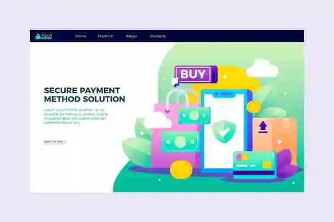
Common issues include:
- Only one payment option;
- No trust signals (such as “Secure Checkout” badges);
- Users are required to create an account to finalize their purchase.
- Surprise fees at the end.
Fix It:
- Provide several payment options (such as UPI, Razorpay, GPay, etc.).
- Permit guest checkout.
- Display the entire cost, including shipping, early.
- Assurance through unambiguous “100% secure” messages.
7. Your Mobile Website Is The Version, Not a Mini Version
More than 60% of users access websites through their smartphones. Mobile responsiveness is now a non-negotiable for conversion rate optimization.
You’re losing out if your mobile version is difficult to use, such as requiring pinching to zoom, loading slowly, or having small text.
Mobile optimization checklist:
- Large, tappable buttons
- Brief sections and paragraphs
- Quick loading times
- Easily fillable forms on mobile devices
- Try it out on an iPhone and an Android device.
8. Test it instead of assuming it works.
Occasionally, altering just one word on a button increases conversions.
However, you won’t know until you test.
Concepts for A/B testing include:
- Headlines
- CTA wording
- Images versus videos
- Long versus short pages
Use tools such as Convert, VWO, or Google Optimize to see what works best for actual visitors.
However, you won’t know what works best for conversion rate optimization until you test.
9. Useful (not annoying) exit popups
If pop-ups seem like a gift rather than a trap, they can be useful. They’re often used in conversion rate optimization to recover lost leads.
Show a popup with the following offers when someone is ready to leave:
- • A free downloadable checklist or guide
- • A fun quiz or giveaway
- • A 10%–15% discount.
Bonus: Make use of “exit-intent” popups, which only show up when a user moves to close the tab.
10. Use Stories, Not Features, to Sell
“Industry-leading software solutions” is a cool but impressive sound.
Try this now:
“Despite having no prior tech experience, Priya made ₹20,000 in her first week of operating her first online store with us.”
Which one seems more authentic?
Include Additional Story Elements:
- Your own founder’s story
- Transformation before and after pictures
- Actual customer testimonials
People can recall stories. They believe stories. And it’s stories that make them buy.
11. Improved Images = Increased Credibility
Design is more than just “looking good.” Credibility is increased.
No matter how good your product is, visitors may leave your website if it appears to be from 2009.
Boost Your Visual Game:
- Use real images of your team, workspace, and products in use
- Create custom graphics using design tools like Canva
- Make buttons, arrows, and important messages prominent.
- Include brief explainer videos—even 30 seconds can have a big impact.
12. Follow Up to Ensure Visitors Don’t Leave
Not everybody will purchase today. This doesn’t mean they’ll never come back.
You have another chance if you get their email.
Give Something in Return:
- A mini-course or challenge
- Early access or discounts
- A free resource (such as an eBook or manual)
Next, send follow-up emails using programs like Brevo, ConvertKit, or Mailchimp.
Instead of just selling, cultivate a relationship.